YouTube thumbnail mistakes are the single most expensive errors a creator can make, because they cost you clicks on every single impression your video receives. You can spend three days scripting, filming, and editing a video that genuinely deserves to be watched. Then you spend twenty minutes slapping together a thumbnail, upload it, and wonder why the CTR is 1.8% when your niche average is 6%. The thumbnail was the bottleneck all along. The content never got a fair chance.
The platform has changed significantly in 2026. YouTube now rewards what researchers call "quality CTR" — clicks that lead to real watch sessions, not just cheap impressions. The algorithm evaluates the full viewer journey from thumbnail to watch time. This means the old clickbait playbook does not just fail to work anymore; it actively hurts your distribution. High CTR paired with poor retention now triggers reduced recommendations. The stakes on getting thumbnails right have never been higher.
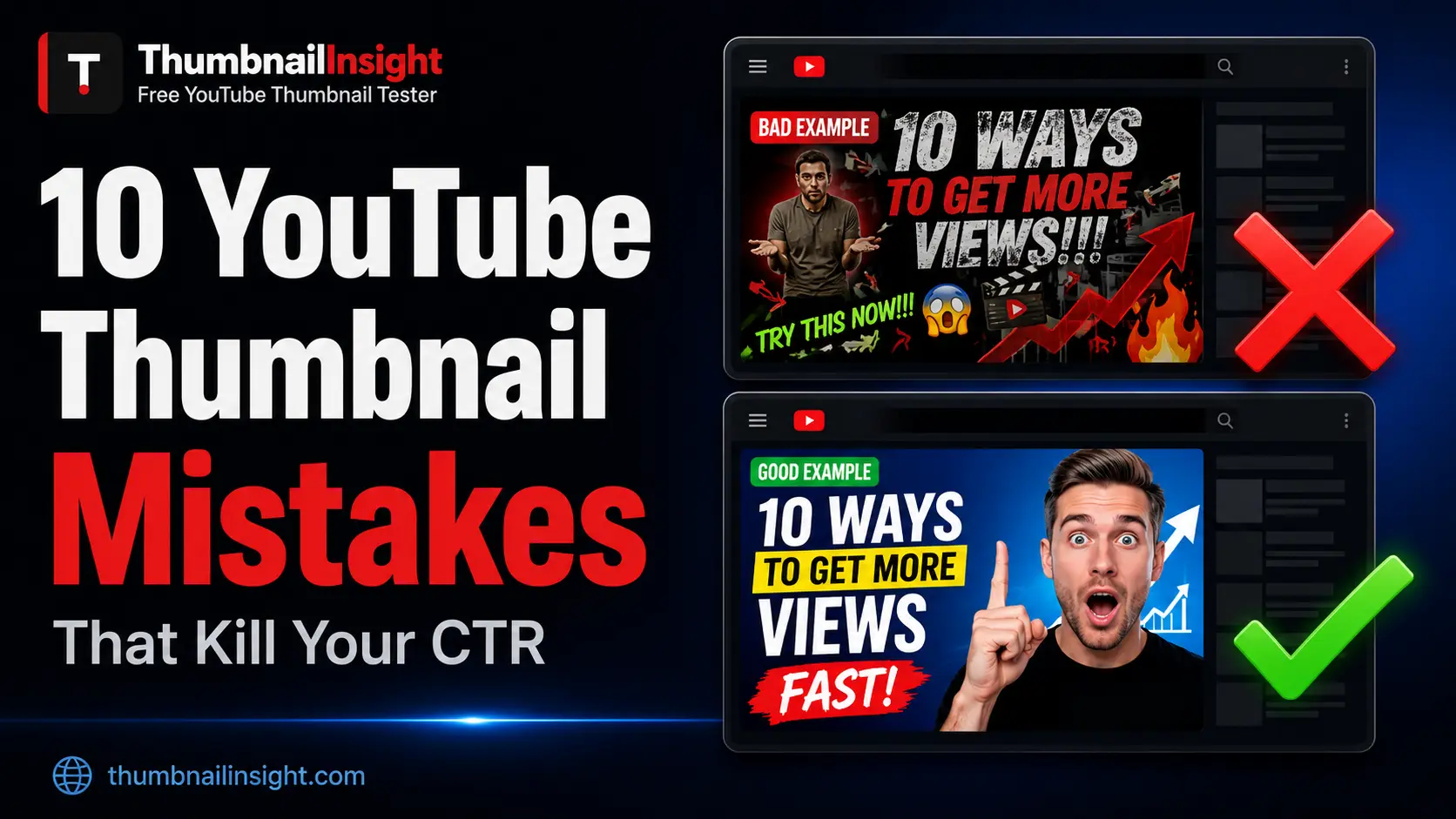
This guide breaks down the ten YouTube thumbnail mistakes that most consistently destroy CTR, ranked by how frequently they appear and how much damage they cause. Each one comes with a clear diagnosis, a data-backed explanation of why it hurts, and a specific fix you can apply before your next upload.
This is the most common YouTube thumbnail mistake and the one with the widest gap between how bad it is and how rarely creators catch it. Over 75% of YouTube views in 2026 happen on mobile devices. Your thumbnail is being judged on a 6-inch screen, in a fast-moving feed, by someone who will spend less than two seconds deciding whether to click. Most creators design on a 27-inch monitor at full 1280 x 720 resolution and never once preview what the thumbnail looks like at mobile scale.
At the mobile feed display size of 120 x 68 pixels, script fonts dissolve into blurry lines. Thin text disappears. A face that looks expressive at full canvas size becomes an unrecognizable smudge. A thumbnail with four lines of text becomes a block of noise that no one can read while scrolling.
Before every upload, shrink your design to 120 pixels wide inside your editing tool. If you cannot read the text and recognise the face instantly at that size, the design needs to change. Alternatively, use ThumbnailInsight to preview your thumbnail at actual mobile display size before publishing. This single check catches more CTR-killing problems than any amount of time spent perfecting the design at full resolution.
More than 60% of YouTube viewing happens on mobile phones. Cramming five or more words onto a thumbnail creates visual noise that viewers scroll past without processing. A finance channel that switched from a six-word text overlay to a two-word hook saw their CTR jump from 2.8% to 7.2% — a change achieved purely by removing words, not redesigning anything else.
The instinct behind text overload is understandable. The creators want to explain what the video is about. The thumbnail feels incomplete without context. But the thumbnail's job is not to explain the video. Its job is to create enough curiosity or desire that the viewer clicks to find out more. A thumbnail that answers the question does not get clicked. A thumbnail that raises the question does.
If your title already says "How I Made $10,000 in 30 Days," your thumbnail does not need to repeat that sentence in smaller text. Let the title carry the specifics. Let the thumbnail carry the emotion, the tension, or the visual hook. When both elements try to say everything, neither one lands.
Limit thumbnail text to three to five words maximum. Use the largest, boldest font that fits cleanly within the safe zone. A good test is to read the thumbnail text aloud in under one second. If it takes longer than that, it is too long.
A 2026 study analysing 1,247 videos found that high-contrast thumbnails averaged a 7.1% CTR compared to just 5.1% for low-contrast designs — a 39% difference in performance from a single design decision. Yellow and black thumbnails achieve an average CTR of 8.2%. Red and white combinations hit 7.6%. Muted, low-contrast palettes consistently underperform regardless of niche.
The reason is simple. The brain processes colour contrast before it processes content. A low-contrast thumbnail does not register as a separate element in the feed — it blends into the surrounding interface and neighbouring thumbnails. The viewer's eye never stops on it. YouTube's homepage is predominantly white and light grey. Warm, saturated colours — red, orange, yellow — naturally contrast against this background. Cool, muted tones disappear into it.
The squint test reveals this instantly. Squint at your thumbnail until it blurs. If the subject and text remain clearly visible, the contrast is sufficient. If the design collapses into an undifferentiated blob, the contrast is too low to survive the feed.
Target a contrast ratio of 4.5:1 between text and background. This is the same standard used in web accessibility guidelines and it is the threshold at which text remains readable across all lighting conditions, screen types, and dark mode settings. Test your thumbnail in greyscale — if it reads clearly without colour, it will work everywhere.
A raw video screenshot used as a thumbnail is one of the most common mistakes among newer creators and one of the most damaging. Auto-generated screenshots are typically dark, grainy, mid-motion frames that carry no intentional visual design, no text, no expression choice, and no compositional decision. They signal amateur production before a viewer watches a single second of the actual video.
Videos with custom thumbnails see 35% higher CTR than those with auto-generated ones on average. That stat alone is reason enough to never rely on a screenshot. But the problem goes deeper. The frame YouTube selects for auto-generation is chosen algorithmically, not creatively. It is usually a transitional frame — someone mid-blink, mid-gesture, or mid-cut — that looks awkward in isolation.
Design every thumbnail intentionally. Take a dedicated photo for the thumbnail during or after filming, with expression, composition, and background planned for thumbnail use rather than video use. The thumbnail photo shoot takes five minutes. The CTR difference it produces lasts the entire life of the video.
Thumbnails with human faces showing clear, high-emotion expressions achieve significantly higher CTR than thumbnails without faces across virtually every niche. The psychological reason is well established — humans are wired to process faces faster than any other visual stimulus. A face communicates emotion, stakes, and personality in a fraction of a second.
The mistake most creators make is not the absence of a face but the size of the face. A face that fills 15% of the thumbnail canvas looks engaged and expressive at 1280 x 720. At 120 pixels wide on mobile, that same face becomes a cluster of indistinct pixels that communicates nothing. The face was there. The viewer could not read it. The click did not happen.
Creators consistently underestimate how large the face needs to be at full canvas size to survive the reduction to mobile display size. The face needs to feel oversized — almost uncomfortably zoomed in — at full resolution. At 120 pixels wide, it will look exactly right.
The face should occupy a minimum of 30% of the thumbnail height. Zoom in further than feels comfortable at full resolution. Check the mobile preview. The expression — surprise, excitement, concern, determination — must be readable as a single clear emotion, not a nuanced blend that requires full resolution to interpret.
YouTube places its video duration timestamp — 12:45, 8:03, 24:11 — in the bottom-right corner of every single thumbnail on every device in every layout. It is always there. It never moves. Any text, number, face, or key visual element you place in the bottom-right area of your thumbnail will be partially or fully covered by this overlay.
This is one of those YouTube thumbnail mistakes that is invisible in your design tool. Canva, Photoshop, and Figma all show your thumbnail in isolation on a white background. YouTube puts its interface on top of it. Creators who never preview their thumbnail inside an actual YouTube layout often spend months unknowingly hiding their key call-out, their key number, or their logo behind a timestamp.
The same issue applies to other edge areas. A progress bar appears on hover in the desktop view along the bottom strip. The Shorts shelf and some playlist displays crop the left edge. Certain mobile playlist views clip the top edge. Edges are not safe for important content.
Keep all critical content within the central safe zone — the inner 1100 x 620 pixels of a 1280 x 720 canvas. Treat a 90-pixel margin inside all four edges as decoration-only territory. Preview your thumbnail inside an actual YouTube layout before publishing to confirm nothing important is covered.
When the title says "I Lost 30 Pounds in 60 Days" and the thumbnail shows a before-and-after graphic with the words "30 LBS IN 60 DAYS" written across it, two things happen. First, the thumbnail adds zero new information to what the title already communicated. Second, the space taken up by that duplicate text could have been used for something that creates additional curiosity, raises an unanswered question, or shows emotion the title cannot convey.
The title and thumbnail should work together as a system, not repeat each other. Each element carries something the other cannot. The title can be specific and informational. The thumbnail should be visual and emotional. When they overlap completely, neither one reaches its potential.
After designing a thumbnail, write down what the title says and what the thumbnail says separately. If they say the same thing, redesign the thumbnail to add something the title does not include — a facial expression, a visual result, a number the title did not mention, or a visual contrast that makes the viewer curious about what happens next.
Research published in 2026 found that thumbnails with more than three distinct visual elements experience 23% lower CTR on average compared to simpler alternatives. Cognitive overload is the mechanism. When a viewer has to work to understand what a thumbnail is about, they do not work — they scroll past and choose something easier to read.
Visual overload takes many forms. Multiple faces with different expressions competing for attention. A product shot next to a graph next to a text overlay next to a logo. A busy background with detailed texture that competes with the foreground subject. Multiple colours with no clear hierarchy. Each added element reduces the speed at which the viewer can grasp the thumbnail's message. At two seconds of consideration time, speed of comprehension is everything.
The minimalist thumbnail trend growing in 2026 is not an aesthetic preference. It is a performance response to data. Neo-minimalist designs with lots of white space and a single clear focal point are gaining ground across niches because they communicate faster than busy, maximalist alternatives.
Apply the one-focal-point rule. One subject. One background contrast. One text hook. Strip every element that does not directly support the central message and test whether the thumbnail is stronger without it. It almost always is.
In YouTube's 2025 and 2026 algorithm updates, the platform shifted explicitly toward what it calls "quality CTR." A thumbnail that generates clicks from viewers who immediately leave because the content did not match the promise now actively hurts channel distribution. High CTR paired with poor retention triggers reduced recommendations. The algorithm no longer just rewards the most-clicked thumbnail. It rewards the thumbnail that attracts viewers who stay.
This means misleading thumbnails — showing a result the video does not deliver, an emotion the content does not justify, or a promise the video does not keep — now carry a direct algorithmic penalty that did not exist at the same intensity two years ago. Creators who built channels on aggressive clickbait are seeing reach decline even when their raw CTR numbers look acceptable.
Think of the thumbnail as a promise and the video as the delivery. The thumbnail should create curiosity or desire about something the video genuinely provides. It can tease, it can raise a question, it can show a partial result — but the viewer who clicks must feel that what they found matched what they expected to find. Derral Eves described this at VidCon 2025 as "earning the click, not just getting it."
Most creators design a thumbnail, look at it in their design tool, feel satisfied, and upload it. They never see it in a YouTube search result. They never see it at mobile feed size. They never see whether the face disappears at 120 pixels wide, whether the text gets clipped by the safe zone, whether the contrast collapses in dark mode, or whether the bottom-right content is hidden behind the duration badge.
This is the thumbnail mistake that makes every other mistake on this list harder to catch. Without a pre-upload preview across the surfaces where your thumbnail actually appears, you have no reliable way to know whether the design decisions you made in your tool translate into the experience your viewer has in the feed.
Testing before upload takes under two minutes. It catches problems you cannot see any other way. And because early CTR signals influence how aggressively YouTube recommends a video, catching these problems before the first impression matters more than catching them after the video has already been served to thousands of people with a broken thumbnail.
Before every upload, preview your thumbnail at ThumbnailInsight across all seven YouTube layouts — search results, home feed, suggested sidebar, mobile feed, bell notification, size test, and contrast test. No account required. Your image never leaves your browser. Fix any flagged issues, re-upload, confirm, then publish.
Myth vs. Fact: YouTube Thumbnail Mistakes Edition
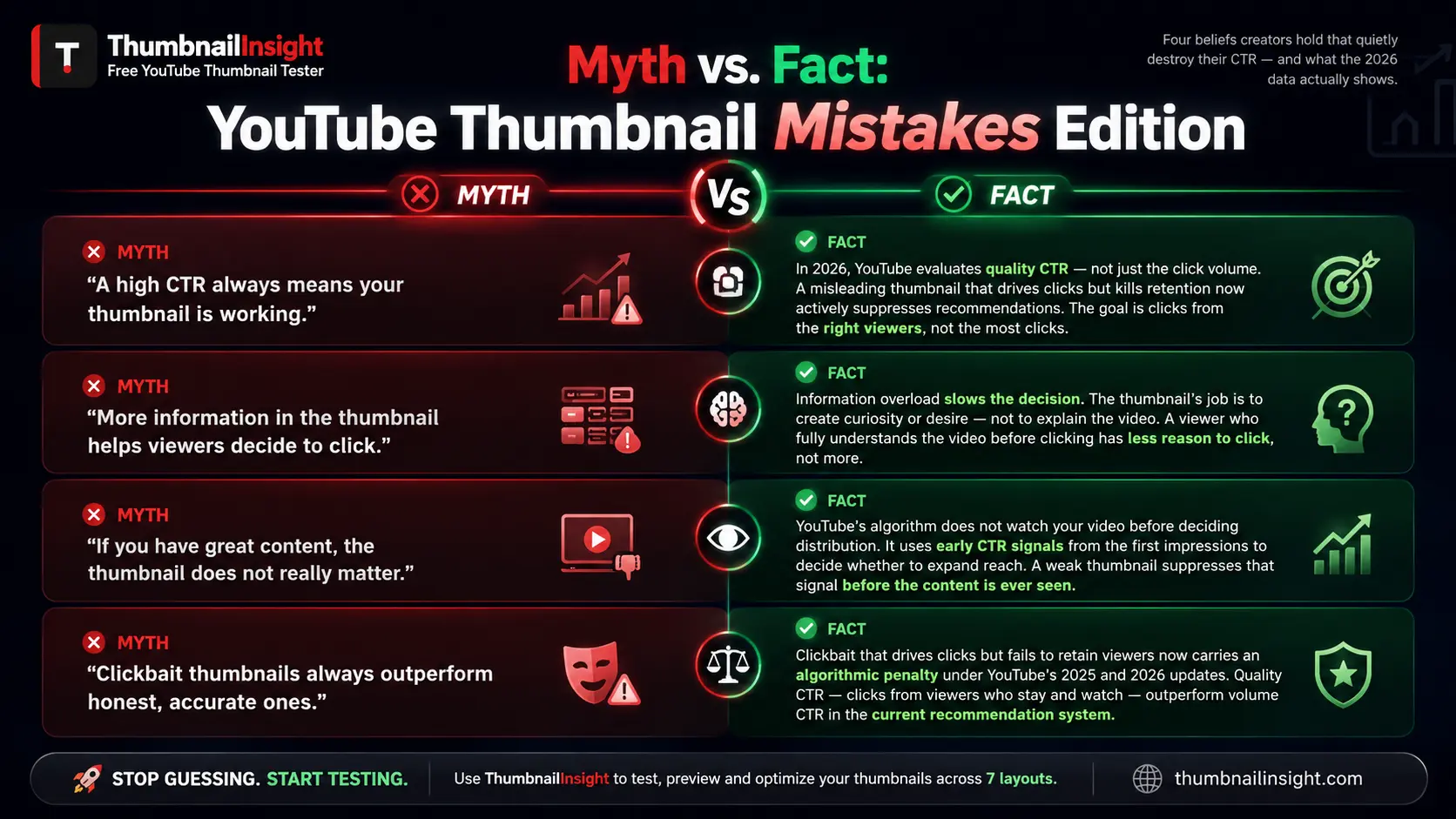
A high CTR always means your thumbnail is working.
In 2026, YouTube evaluates the quality of the click, not just the quantity. A thumbnail that inflates CTR by misleading viewers causes poor retention, which reduces recommendations and suppresses the video over time. The goal is not the highest CTR — it is the highest CTR from the right viewers.
More information in the thumbnail helps viewers decide to click.
Information overload slows the viewer's decision-making. The thumbnail's job is to create desire and curiosity, not to explain the video. The viewer does not need to understand the video before clicking. They need to want to find out what happens.
If you have good content, the thumbnail does not matter that much.
YouTube's algorithm does not watch your video before deciding how many people to show it to. It uses early signals — primarily CTR from the first batch of impressions — to decide whether to expand distribution. A weak thumbnail suppresses that signal before the content ever gets a fair audience.
Clickbait thumbnails always outperform honest ones.
Clickbait thumbnails that drive clicks but fail to retain viewers now actively hurt channel recommendations under YouTube's 2025 and 2026 algorithm updates. Quality CTR — clicks from viewers who stay and watch — outperforms volume CTR in the current recommendation system.
What Consistent Thumbnail Analysis Reveals
After reviewing thumbnail performance data across thousands of YouTube channels in every major niche — gaming, finance, education, lifestyle, tutorial, and entertainment — the pattern that appears most consistently is not about any single design element. It is about the distance between where creators spend their design energy and where viewers actually encounter the result.
Creators spend the most time perfecting details that are only visible at full canvas resolution. Lighting adjustments. Colour grading. Fine text kerning. Background detail. These decisions matter at 1280 x 720. They are invisible at 120 pixels wide on a phone screen in a moving feed.
The creators who consistently hit above-average CTR across their catalogues have one habit in common. They test before they publish. They check their mobile. They check contrast. They verify the safe zone. They look at the notification preview and the size test. They treat the thumbnail preview step as non-negotiable, not optional. The two-minute pre-upload check finds more real problems than two hours of design refinement at full resolution.
Frequently Asked Questions
Conclusion
YouTube thumbnail mistakes are not always obvious. Most of them are invisible in your design tool, which is exactly why they are so costly. The text that looks clear at full canvas size becomes unreadable at 120 pixels wide. The face that looks expressive at 1280 x 720 becomes a smudge on a phone screen. The key number you placed in the corner is hidden behind a duration badge on every single video ever uploaded.
The ten mistakes in this guide are responsible for more lost clicks, suppressed videos, and stalled channels than almost any other single factor in YouTube growth. None of them require advanced design skills to fix. They require awareness, a pre-upload testing habit, and a willingness to view your thumbnail the way your viewer actually sees it — not the way your design tool presents it.
Fix these ten things. Preview before every upload. Build thumbnails for the 120-pixel mobile feed, not the 1280 x 720 export canvas. The algorithm rewards creators who attract the right click and keep the viewer. That chain starts with a thumbnail that works.
Ready to test your thumbnail?
Upload yours free at ThumbnailInsight. No account needed, results in under two seconds.
Test your thumbnail free →