The ability to preview your YouTube thumbnail on mobile before uploading is the single most underleveraged habit in the creator space, and the gap between creators who do it and creators who do not shows up directly in their CTR numbers. Over 75% of YouTube views in 2026 happen on mobile devices. Your thumbnail is not being judged on your design software canvas. It is being judged on a 6-inch screen, in a scrolling feed, by someone giving it less than two seconds of attention. If you have never seen your thumbnail the way that viewer sees it, you are making every design decision based on completely wrong information.
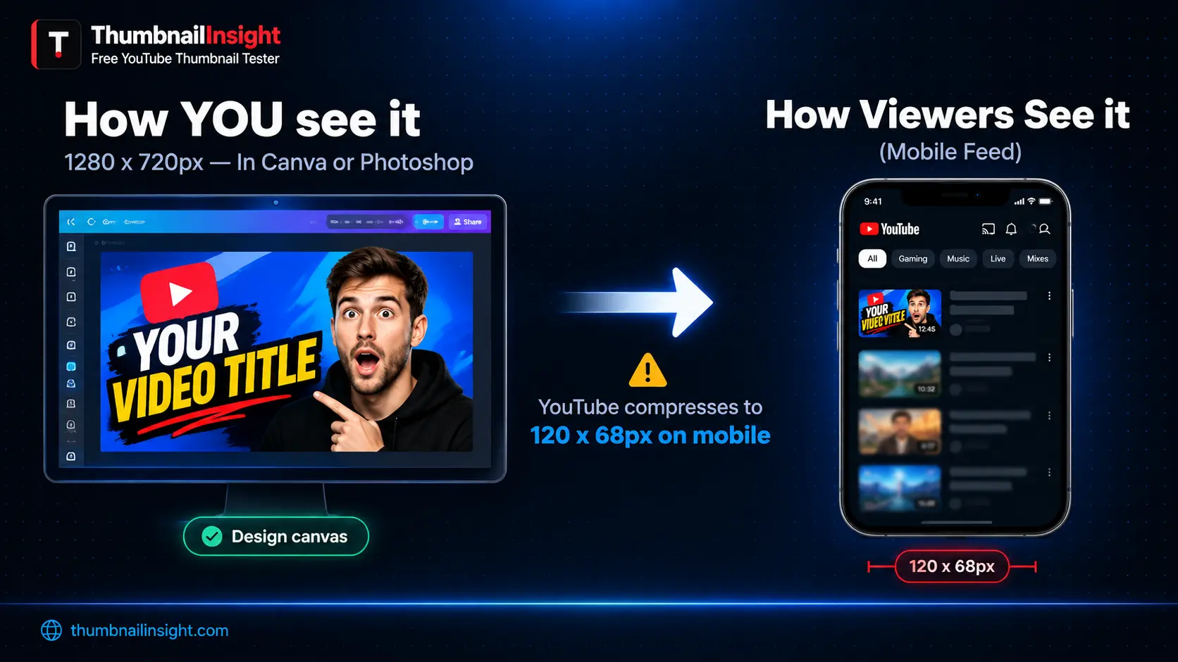
The problem is invisible by design. Canva, Photoshop, and Figma all show your thumbnail at full 1280 x 720 resolution on a white background with no competing content around it. YouTube shows it at 120 x 68 pixels on a phone screen, surrounded by competing thumbnails, inside a dark or light interface that changes the way every colour reads. These are not the same experience. Text that looks bold and readable at full canvas size becomes an illegible smudge at mobile display scale. A face that looks expressive and detailed at 1280 pixels wide registers as a blurry cluster of pixels at 120 pixels wide. A design that looks polished in isolation looks invisible in a feed full of high-contrast alternatives.
This guide covers every method available in 2026 to preview your YouTube thumbnail on mobile before uploading, from the fastest free tools to the manual methods you can use without any additional software. By the end you will have a pre-upload mobile preview process that takes under two minutes and catches the problems no design tool will ever show you.
Why Mobile Preview Is Not Optional in 2026
Over 70% of YouTube watch time comes from mobile devices, and thumbnails appear much smaller on phones, so text and details that look great on desktop may be unreadable on mobile. This is not a fringe scenario. It is the primary way your audience encounters your content.
At the mobile feed display size of 120 x 68 pixels, the design rules that apply at full canvas resolution change completely. A font that reads at 16pt at full size becomes invisible. A three-element composition collapses into visual noise. A face placed at 25% of the canvas height becomes unrecognisable. Mobile thumbnails appear much smaller than desktop versions — sometimes 70% smaller — and small text, fine details, and subtle elements become unreadable.
Studies consistently show that thumbnails drive 70 to 90% of a viewer's decision to click on a video. The mobile feed is where the majority of those decisions happen. Designing a thumbnail without ever checking it at mobile scale means optimising for a display size that a minority of your actual audience uses and ignoring the surface that drives most of your impressions.
📱 2026 Data: Design mobile-first for the 120-pixel feed where over 70% of viewing happens. Mobile preview is not a final quality check. It is the primary design constraint every thumbnail should be built around from the start.
What You Are Actually Looking for in a Mobile Preview
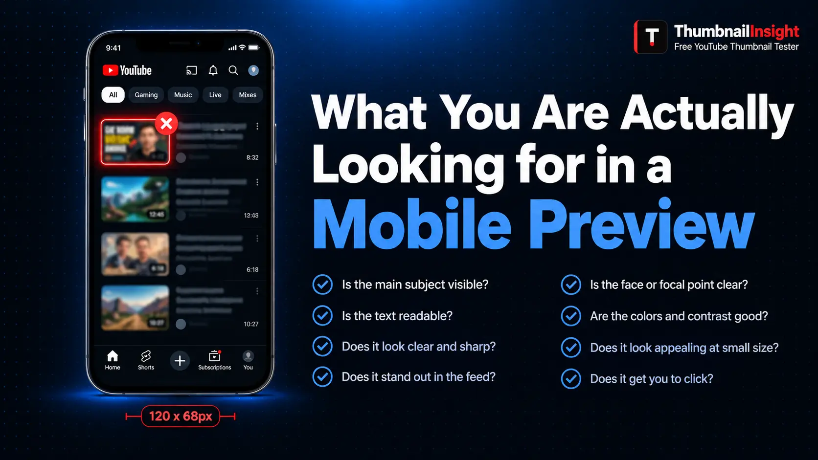
Before covering the specific methods, it is worth being precise about what a mobile preview should reveal. The goal is not just to see the thumbnail at a smaller size. It is to evaluate four specific qualities that only become apparent at mobile display scale.
Can you read every word of the text on the thumbnail in under one second without squinting? If the answer is no at mobile scale, the answer will also be no for the majority of your viewers scrolling the feed. The minimum effective font size on a 1280 x 720 canvas is 60pt in a bold sans-serif typeface. Anything smaller dissolves at mobile resolution.
Can you immediately identify the dominant subject — a face, a product, an object — without having to study the image? A face that communicates a clear emotion at full canvas size often communicates nothing at 120 pixels wide because the emotional cues are in the fine details of the eyes and mouth, which disappear at small scale.
Does the thumbnail still stand out against YouTube's feed background at mobile size? Colours that look vivid and bold at full resolution can lose saturation and impact when compressed to mobile display dimensions. Squint at the mobile preview until the image blurs. Does your thumbnail still separate visually from the surrounding elements, or does it merge into the background?
At 120 pixels wide, is there one clear focal point, or does the composition break into visual noise? A thumbnail with three competing elements at full size often becomes unreadable noise at mobile scale. One subject, one background contrast, one text hook is the formula that survives the reduction.
5 Methods to Preview Your YouTube Thumbnail on Mobile
The fastest and most comprehensive way to preview your YouTube thumbnail on mobile before uploading is ThumbnailInsight. The tool shows your thumbnail at actual YouTube mobile display dimensions (120 x 68 pixels) inside a realistic mobile feed layout, surrounded by neighbouring thumbnails and your actual video title, exactly as a viewer would see it in the YouTube app.
- Go to thumbnailinsight.com and upload your thumbnail file. JPG, PNG, and WebP are all accepted.
- Enter your planned video title and channel name.
- The preview renders immediately across all seven layouts.
- Switch to the mobile tab to see your thumbnail at actual mobile feed size.
- Check whether the text is readable, the face is recognisable, and the design stands out against the surrounding elements in the feed.
No account is required. Your image never leaves your browser. The entire process takes under two minutes and is the single most effective pre-upload check available for free.
Open Google Chrome and go to YouTube. Right-click anywhere on the page and select Inspect from the context menu. At the top of the DevTools panel, click the device toolbar icon — it looks like a small phone and tablet icon side by side.
Your browser switches to mobile simulation mode. Select a phone model such as iPhone 14, Samsung Galaxy S23, or Pixel 7. YouTube will reload in the simulated mobile layout, showing thumbnails at actual mobile display dimensions.
Navigate to a search results page or the home feed to see your thumbnail the way it appears to a phone user. This method requires a published or scheduled thumbnail since it shows live YouTube content.
In Canva: Use the zoom slider to reduce the canvas view to approximately 9% of full size. At that zoom level a 1280 x 720 canvas displays at roughly the same visual size as a YouTube mobile feed thumbnail on a standard monitor.
In Photoshop: Use Image Size to temporarily resize the document to 120 x 68 pixels and evaluate at 100% zoom. Do not save. Use only for evaluation then undo.
In Figma: Create a separate 120 x 68 frame next to your main design and paste a scaled copy into it for a direct side-by-side comparison.
After uploading a thumbnail to YouTube Studio, open YouTube Studio on your phone and preview the video from the content dashboard. This is the most accurate mobile preview possible because it uses YouTube's actual app rendering engine on your real phone screen.
The limitation is timing. You cannot use this method before publishing. The best use case is as a post-upload confirmation step within the first few minutes after publishing, while you can still replace the thumbnail before significant impressions accumulate.
Open your thumbnail design file on your desktop or laptop, set it to fill the full screen, then hold your phone at arm's length from your body and look at the laptop screen from that distance.
At arm's length, a standard 13-inch laptop screen displays a 1280 x 720 image at roughly the same perceived visual size as a YouTube mobile feed thumbnail.
This catches the most severe problems: text that is completely unreadable, faces that disappear entirely, and designs that lose all structure when viewed small. It takes ten seconds and requires nothing except the laptop you are already using.
The 5 Most Common Problems Mobile Preview Reveals
Across thousands of thumbnails tested in mobile preview environments, five problems appear more consistently than any others. These are the issues that look perfectly fine at full canvas resolution and become obvious the moment you see the thumbnail at 120 pixels wide.
Text that looks bold and clear at 1280 x 720 becomes illegible at mobile display size. The cause is almost always font size that is too small, font weight that is too light, or a font style — script, decorative, condensed — that does not hold up at small sizes. Bold sans-serif fonts at 60pt minimum solve this problem in most cases.
The expressive detail that makes a face interesting at full resolution disappears at mobile scale. What survives is the broad shape of the expression: mouth open or closed, eyebrows raised or furrowed, face toward or away from camera. Mobile preview reveals whether the broad strokes are strong enough to communicate at small sizes.
Colours that feel vivid in a design tool can look muted and low-contrast when compressed to mobile display dimensions and placed next to the high-contrast thumbnails of competing creators. The greyscale contrast test is the fastest way to evaluate whether contrast relies on hue alone or on genuine luminosity difference.
At mobile scale, YouTube's duration badge is large relative to the thumbnail size and covers a significant portion of the bottom-right quadrant. Any important element placed there is hidden. This problem is only visible when the thumbnail is previewed inside an actual YouTube layout — never in a design tool.
Three or four visual elements that are clearly separated at full canvas size can merge into an undifferentiated mass at mobile display size. If the thumbnail has no clear dominant element at 120 pixels wide, it will not arrest a viewer's scroll.
Myth vs. Fact: Mobile Preview Edition
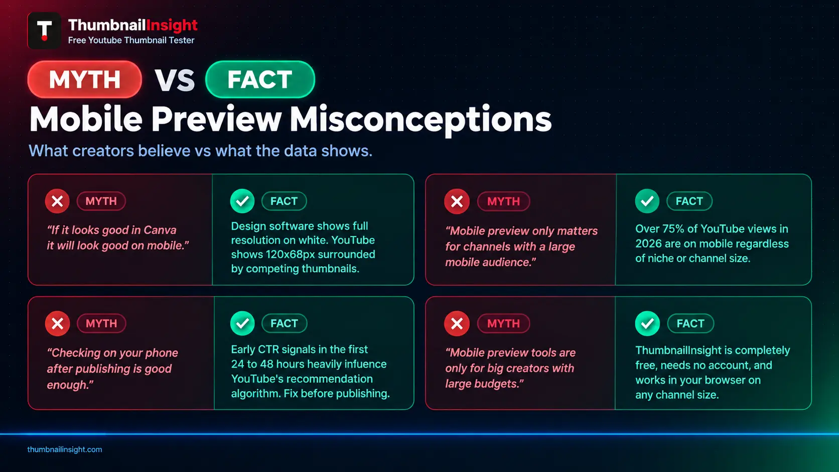
If a thumbnail looks good on your design software canvas, it will look good on mobile.
Design software shows your thumbnail in isolation at full resolution on a white background. YouTube shows it at 120 x 68 pixels on a phone, surrounded by competing thumbnails, in a dark or light interface. A thumbnail can look polished in Canva and invisible in a mobile feed simultaneously.
Mobile preview only matters for channels with a large mobile audience.
Over 75% of YouTube views in 2026 come from mobile devices regardless of niche. Gaming, finance, education, lifestyle — every category has a mobile-dominant audience. Mobile preview is the default viewing context for the majority of every channel's audience.
Checking the thumbnail on your own phone after publishing is good enough.
By the time you check the published thumbnail on your phone, YouTube has already served it to a portion of your initial audience. Early CTR signals from the first 24 to 48 hours carry significant weight in YouTube's recommendation algorithm. Problems found after publishing are recoverable but not without cost.
A dedicated mobile preview tool is only useful for big creators with large budgets.
ThumbnailInsight is completely free, requires no account, and processes your thumbnail in your browser without ever uploading it to a server. The two-minute pre-upload check is equally available to a channel with 50 subscribers and a channel with 5 million.
How to Build Mobile Preview into Your Workflow
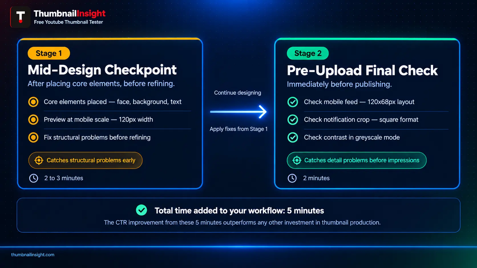
The most effective approach is to treat mobile preview not as a final check but as a mid-design checkpoint. Most experienced creators who test consistently use a two-stage process.
Once the core elements (face, background, text) are placed but before refinement begins, preview at mobile scale. This early check reveals structural problems: a composition that does not work at small sizes, text that is fundamentally too small, and a background that competes with the foreground subject. Catching these problems in the middle of the design process saves the time that would otherwise be spent refining a structure that was never going to survive mobile scale.
The final thumbnail is checked at mobile scale, in the notification preview, and in the contrast test. Any remaining issues are fixed before the first impression is served. This is the stage ThumbnailInsight is optimised for — a rapid, comprehensive check across all seven YouTube layouts in less than two minutes.
⏱ Time investment: Together these two stages add approximately five minutes to the total thumbnail creation process. The CTR improvement from catching and fixing mobile-scale issues before upload consistently exceeds the value of any other five-minute investment in thumbnail production.
What Consistent Mobile Testing Reveals Over Time
After analysing thumbnail performance data across thousands of channels and tracking the before-and-after CTR outcomes of creators who adopted pre-upload mobile preview as a consistent habit, the findings are consistent enough to be treated as reliable guidance rather than anecdote.
Creators who add mobile preview to their pre-upload workflow see measurable CTR improvement within the first three to five videos. The improvement is not always dramatic in the first video because the first test reveals the problems and the second video is the first to benefit from the fixes. By the third or fourth video, the design changes that mobile preview prompted — larger text, stronger face composition, higher contrast, cleaner focal point — are embedded in the creator's default approach and the improvement compounds.
The creators who see the largest CTR gains from mobile preview are not the ones with the most complex designs. They are the ones whose previous thumbnails contained the most fundamental mobile-scale problems: text that was 20pt when it should have been 80pt, fonts that were script or decorative when they should have been bold sans-serif, compositions with four elements when one was enough. Mobile preview does not improve good design. It reveals the gap between how a design looks to the creator and how it appears to the viewer.
Frequently Asked Questions
Conclusion
The ability to preview your YouTube thumbnail on mobile is not a technical skill. It is a habit, and it is a habit that pays for itself immediately and compounds over time. Every video you publish without a mobile preview is a video where the design decisions were made without reference to the display environment that the majority of your audience will use.
The methods in this guide range from a two-minute tool check to a ten-second arm's length test. All of them are available to every creator right now regardless of budget, channel size, or technical skill level. The gap between channels that test before upload and channels that do not is visible in their CTR data and it widens with every video published.
Check the mobile feed preview. Check the notification crop. Check the contrast in greyscale. Fix what does not work. Publish with confidence that the thumbnail your viewer sees matches the design you intended.
Preview your YouTube thumbnail on mobile
See your thumbnail at real mobile display size across all 7 YouTube layouts. No account needed, results in under two seconds.
Test your thumbnail free →